Typography
Overview
Ascando Partners uses a typography system designed to balance character and clarity. Our primary typeface, Arizona Flare, was chosen for its refined serif details and contemporary structure. It brings just enough personality and authority to signal experience and credibility, while remaining clean and restrained enough to feel modern and precise. This balance reflects who we are as a consultancy: thoughtful, structured, and forward-looking, without feeling distant or academic.
Arizona Flare is used for headlines and key messages where tone and presence matter most. Our secondary typeface, Diatype, provides a neutral and highly readable counterpart. It is used for body text, data, and technical content, ensuring clarity and consistency across all applications. Together, the two typefaces create a visual language that feels confident, calm, and credible, supporting both strategic thinking and practical execution.

Main Typeface
Arizona flare
Secondary typeface
Diatype
Uppercase
ABCDEFGHIJKLMNOPQRSTUVWXYZ
Uppercase secondary
ABCDEFGHIJKLMNOPQRSTUVWXYZ
Lowercase
abcdefghijklmnopqrstuvwxyz
Lowercase secondary
abcdefghijklmnopqrstuvwxyz
Numerals
1234567890
Numerals secondary
1234567890
Accented Uppercase
ÀÁÂÃÄĀĂÅǺĄÆǼĆĈČĊÇĎĐÐÈÉÊĚËĒĔĖĘĜĞĠĢ
ĤĦÌÍÎĨÏĪĬİĮIJĴĶĹĽĻŁĿŃŇÑŅŊÒÓÔÕÖŌŎŐØǾŒÞŔŘ
ŖŜŠŚŞȘẞŤȚŢŦÙÚÛŨÜŪŬŮŰŲẀẂŴẄỲÝŶŸŹŽŻ
Accented Uppercase secondary
ÀÁÂÃÄĀĂÅǺĄÆǼĆĈČĊÇĎĐÐÈÉÊĚËĒĔĖĘĜĞĠĢ
ĤĦÌÍÎĨÏĪĬİĮIJĴĶĹĽĻŁĿŃŇÑŅŊÒÓÔÕÖŌŎŐØǾŒÞŔŘ
ŖŜŠŚŞȘẞŤȚŢŦÙÚÛŨÜŪŬŮŰŲẀẂŴẄỲÝŶŸŹŽŻ
Accented Lowercase
àáâãäāăåǻąæǽćĉčċçďđðèéêěëēĕėęĝğġģ
ĥħìíîĩïīĭıįijĵȷķĺľļłŀńňñņŋòóôõöōŏőøǿœþŕřŗśŝšşș
ßťțţŧùúûũüūŭůűųẁẃŵẅỳýŷÿźžż
Accented Lowercase secondary
àáâãäāăåǻąæǽćĉčċçďđðèéêěëēĕėęĝğġģ
ĥħìíîĩïīĭıįijĵȷķĺľļłŀńňñņŋòóôõöōŏőøǿœþŕřŗśŝšşș
ßťțţŧùúûũüūŭůűųẁẃŵẅỳýŷÿźžż
Punctuation
(¡¿!?.:,;…)[&&@#]{-–—|¦·}‹›«»‘’“”‚„'"•/\
Punctuation secondary
(¡¿!?.:,;…)[&&@#]{-–—|¦·}‹›«»‘’“”‚„'"•/\
Numerators, Denomerators
1234567890 1234567890
Numerators, Denomerators secondary
1234567890 1234567890
Symbols
&%‰©℗®™°§¶*†‡#№
Symbols secondary
&%‰©℗®™°§¶*†‡#№
Arrows
←→↑↓
Arrows secondary
←→↑↓
Fractions
¼½¾⅓⅔⅛⅜⅝⅞
Fractions secondary
¼½¾⅓⅔⅛⅜⅝⅞
Weights
The primary typeface is available in several weights and is mainly used in Light to preserve an elegant and confident expression. For functional elements such as buttons or short interface labels, Regular may be used to improve clarity.
The secondary typeface is primarily used in Regular to ensure optimal readability in longer texts and technical content.This balance keeps the typography refined without sacrificing usability.
Body Copy, Short Paragraphs, Subheaders
Diatype Regular
Headlines, Short Paragraphs
Arizona flare light
Headlines, Accents
Arizona flare light
Setting Type
Typography should always be left aligned or centre aligned. Avoid right alignment and justified text, as this reduces readability and creates unnecessary visual tension. Simple alignment supports clarity and allows the typography to breathe within the layout.

Do’s

Dont's

Do’s
Dont's
Type Hierarchy
Use a maximum of three font sizes within a single composition. Each level should be at least 50 percent larger than the next to create a clear and natural visual structure.In rare cases where this is not possible, a minimum size difference of 35 percent should be maintained. A clear hierarchy helps guide the reader and reinforces the brand’s calm and structured character.


In some cases, it may be necessary to break this rule and have two font sizes that are closer together. In such cases, a minimum difference of 35% should be followed.
Type on image
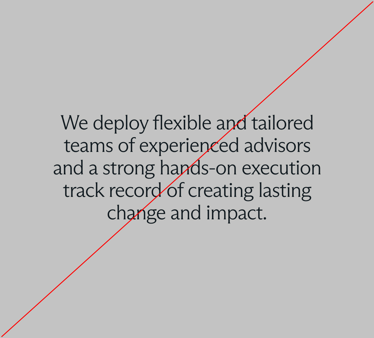
Text may be placed on images, but only when sufficient contrast is ensured. Use dark typography on light images and white typography on dark images. Avoid using coloured text on images. Typography should always remain legible and calm, never competing with the image itself.

Do’s

Dont's
