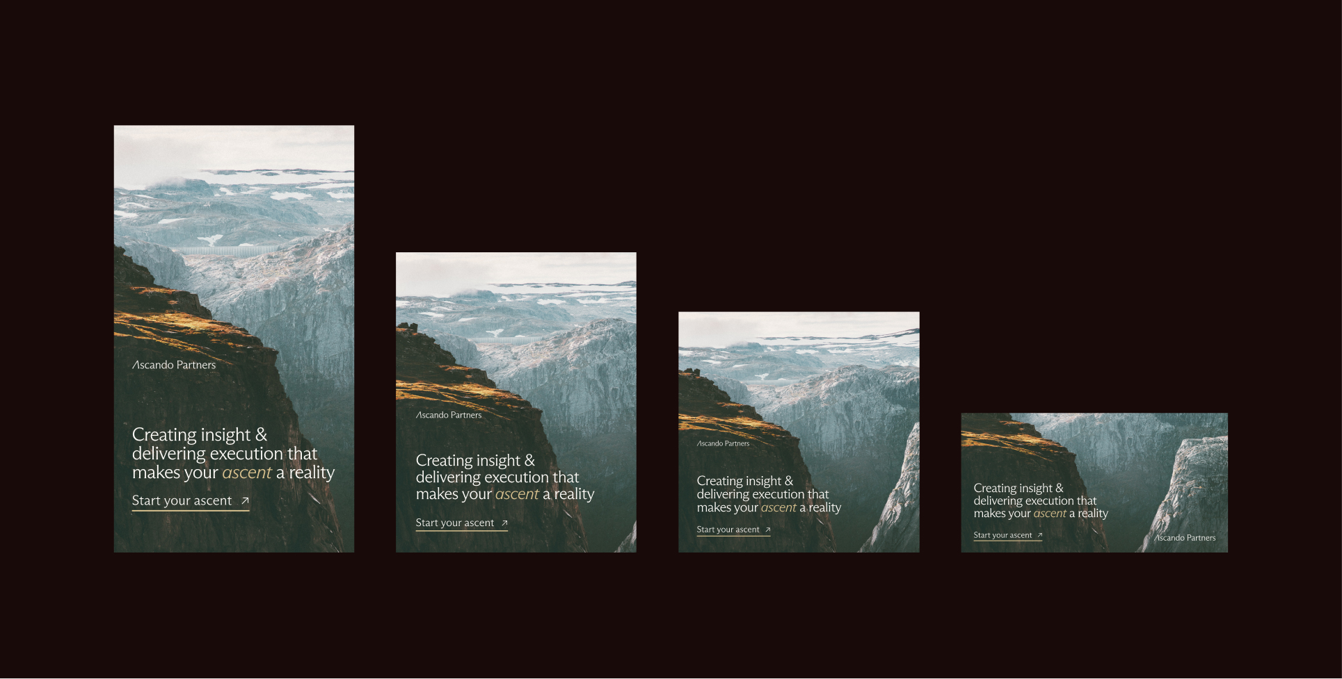
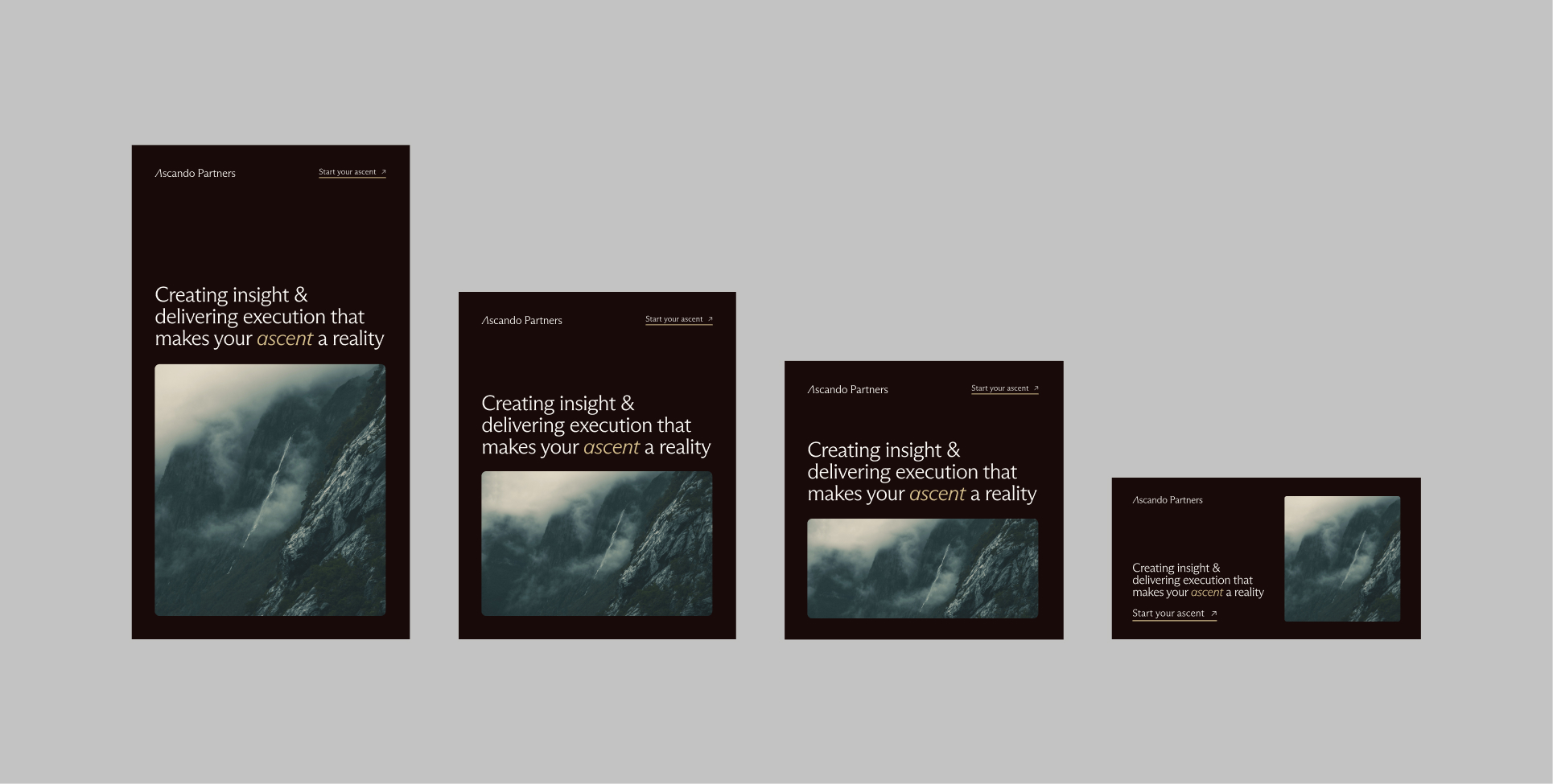
Layouts
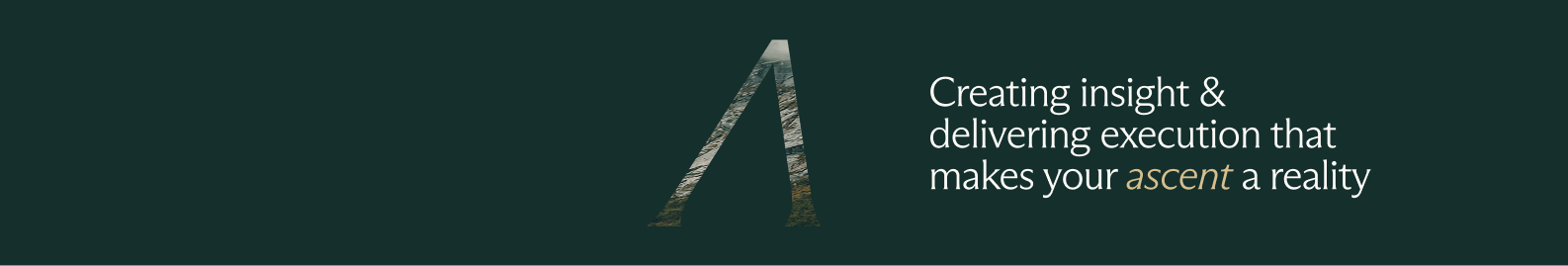
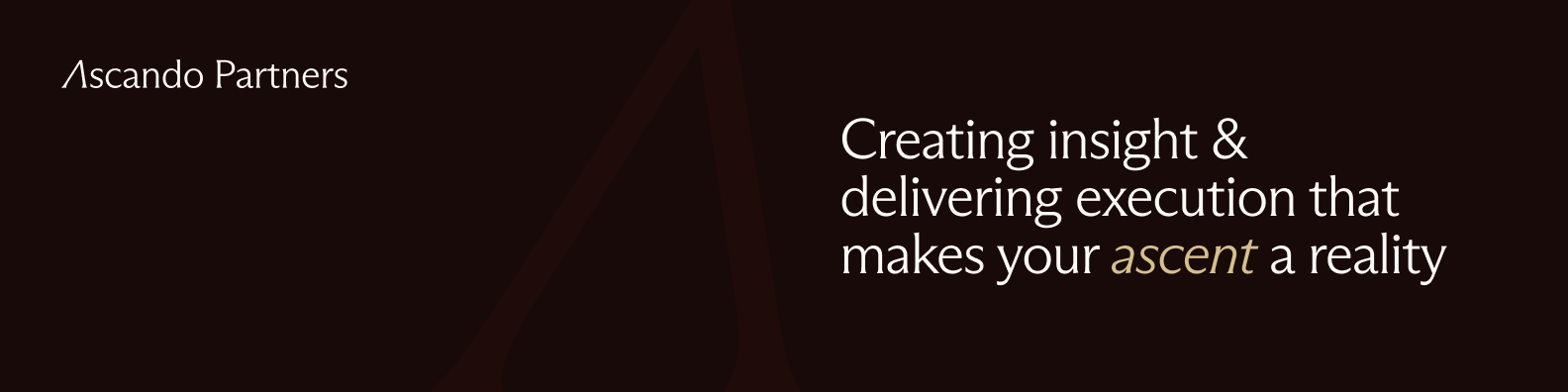
Key visuals
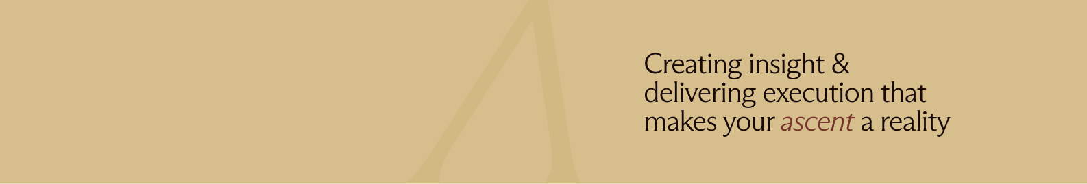
By combining layout, color, typography, and logo usage, we create a coherent visual system that strengthens recognition and trust. Key visuals should feel calm and intentional. They rely on generous white space, clear hierarchy, and restrained composition. The goal is not to decorate, but to guide the eye and support the message. Every element should have a reason to be there. If something does not add clarity, it should be removed.
Photography
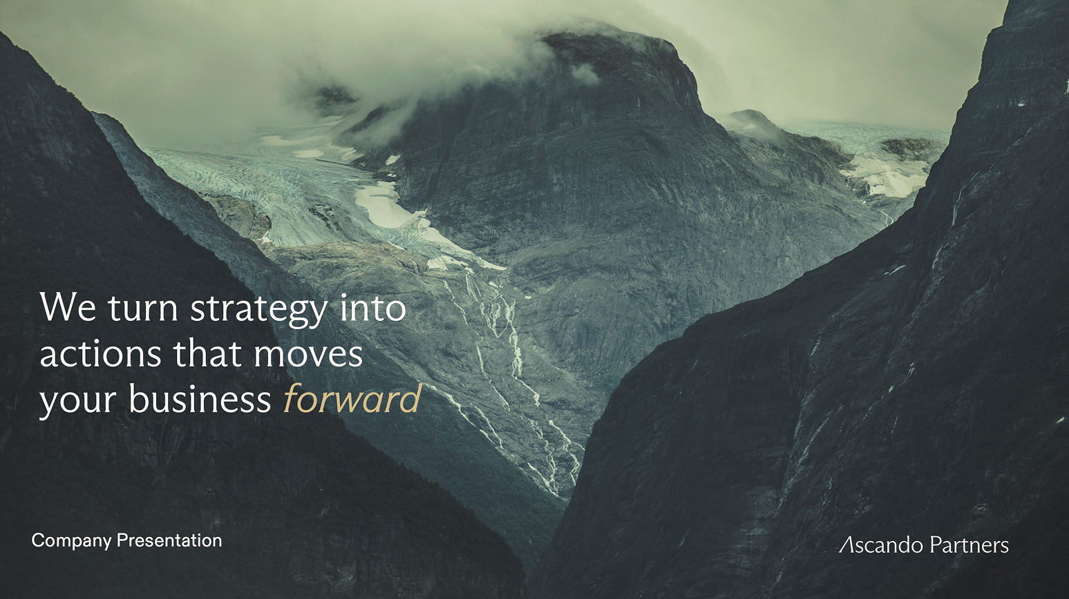
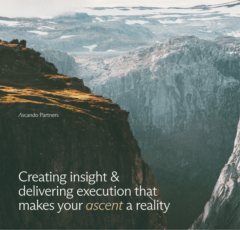
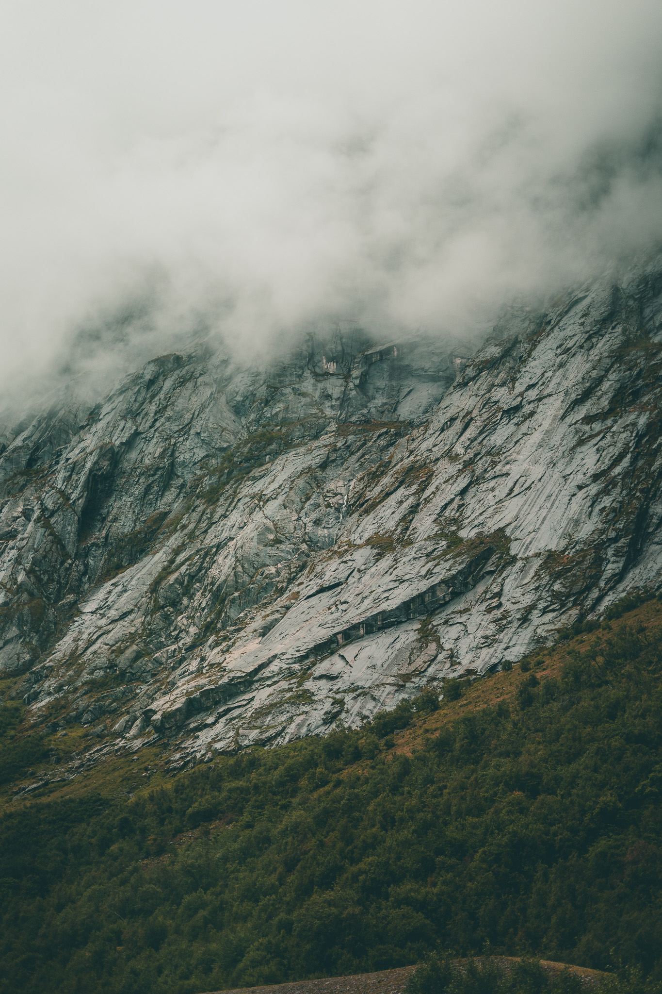
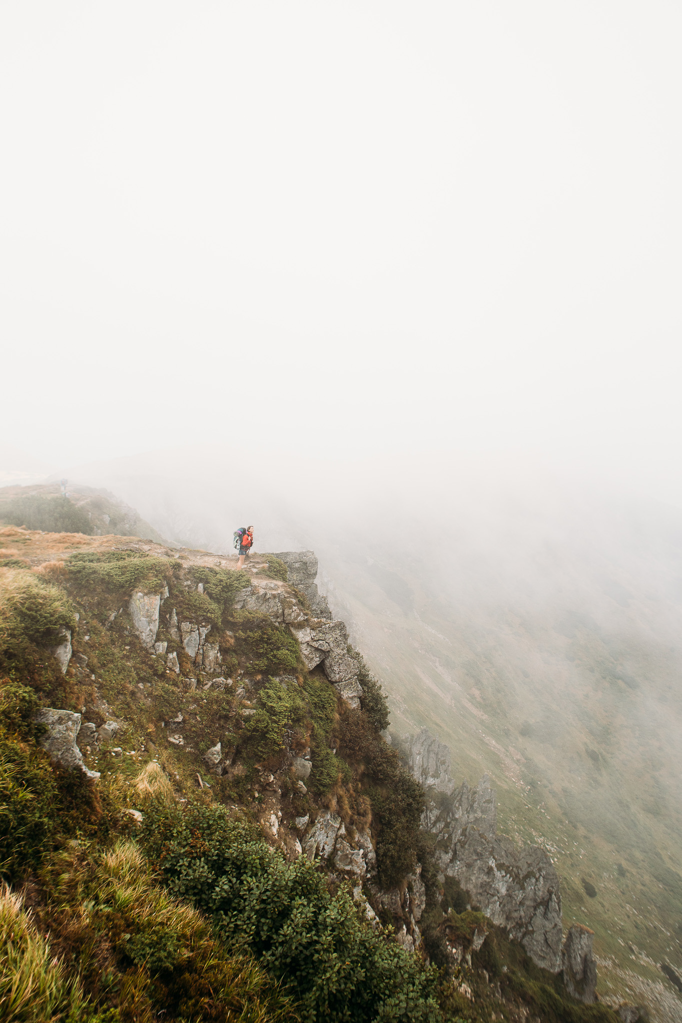
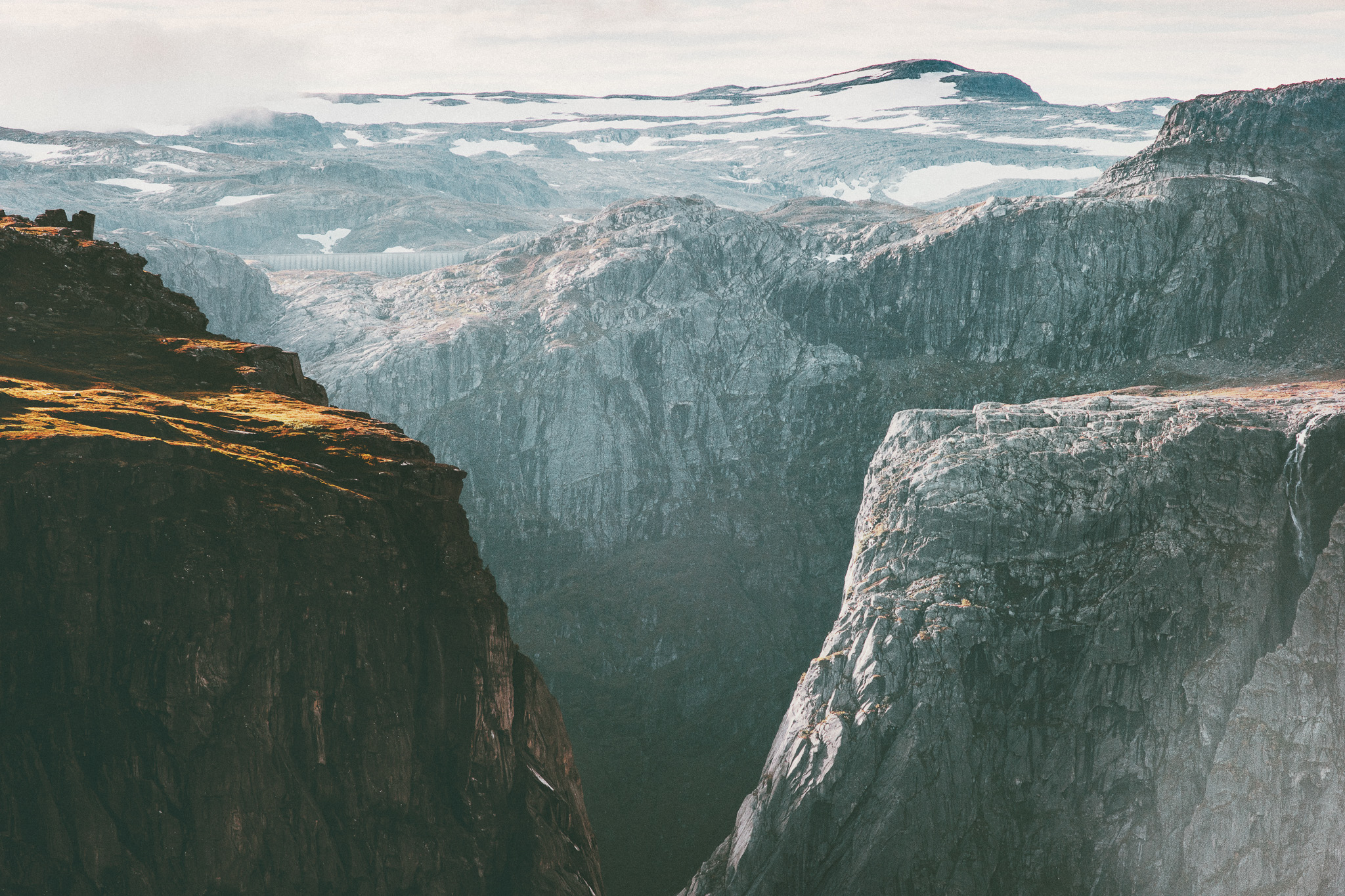
Photography should feel real, calm, and grounded. We use natural light, muted colors, and honest moments rather than staged or overly polished scenes. Images should communicate scale, depth, and presence, and leave room for typography to breathe. Avoid stock-like expressions, heavy filters, or dramatic effects. Subtlety creates credibility.


.jpg)


Social media
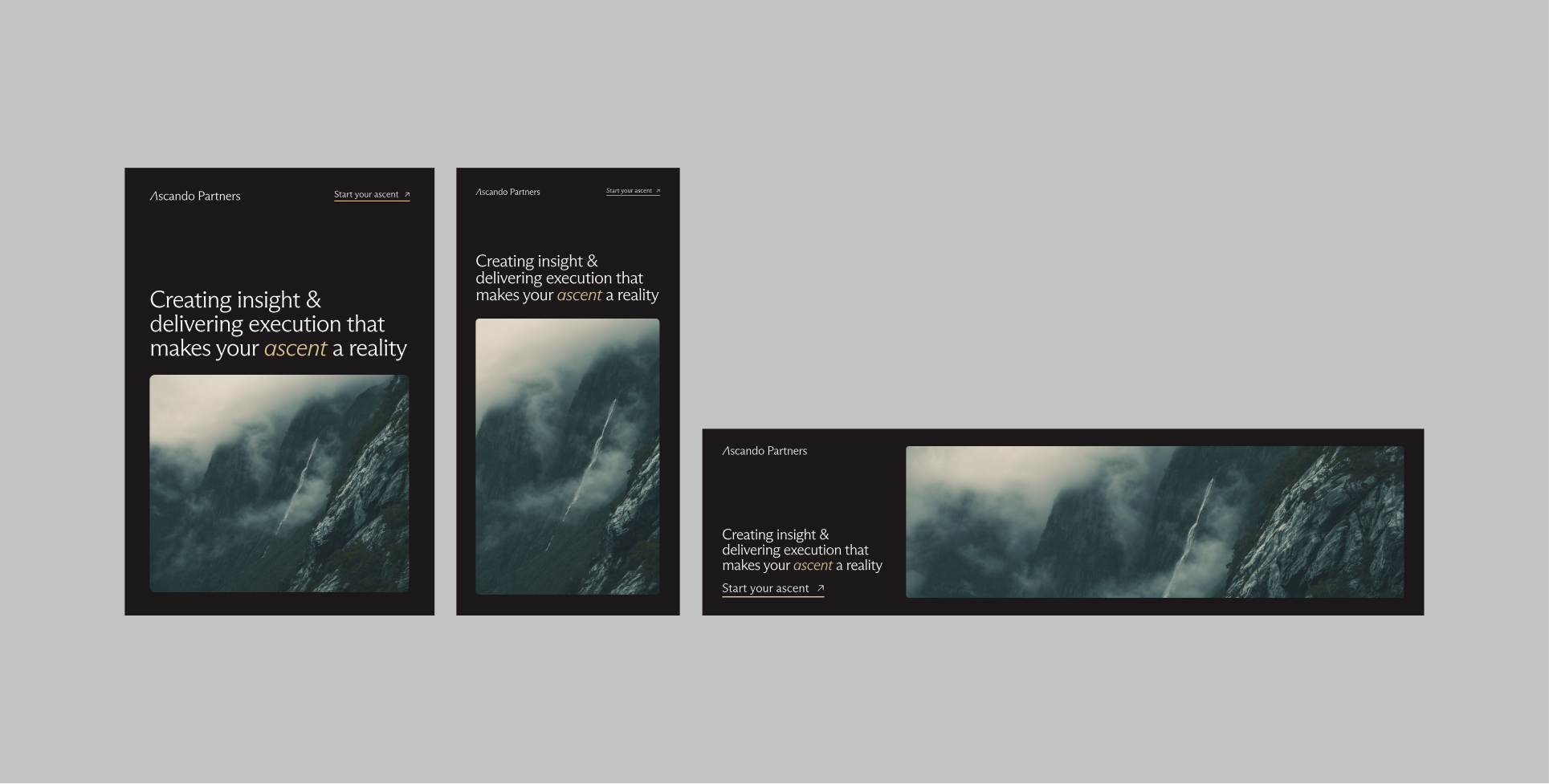
Communication on social media should be simple, clear, and direct. Layouts should prioritise one message at a time, supported by strong imagery and generous spacing. Color and shape can be used to highlight the content, but never to overpower it. Consistency across formats is more important than visual complexity. The feed should feel recognisable even when individual posts vary.


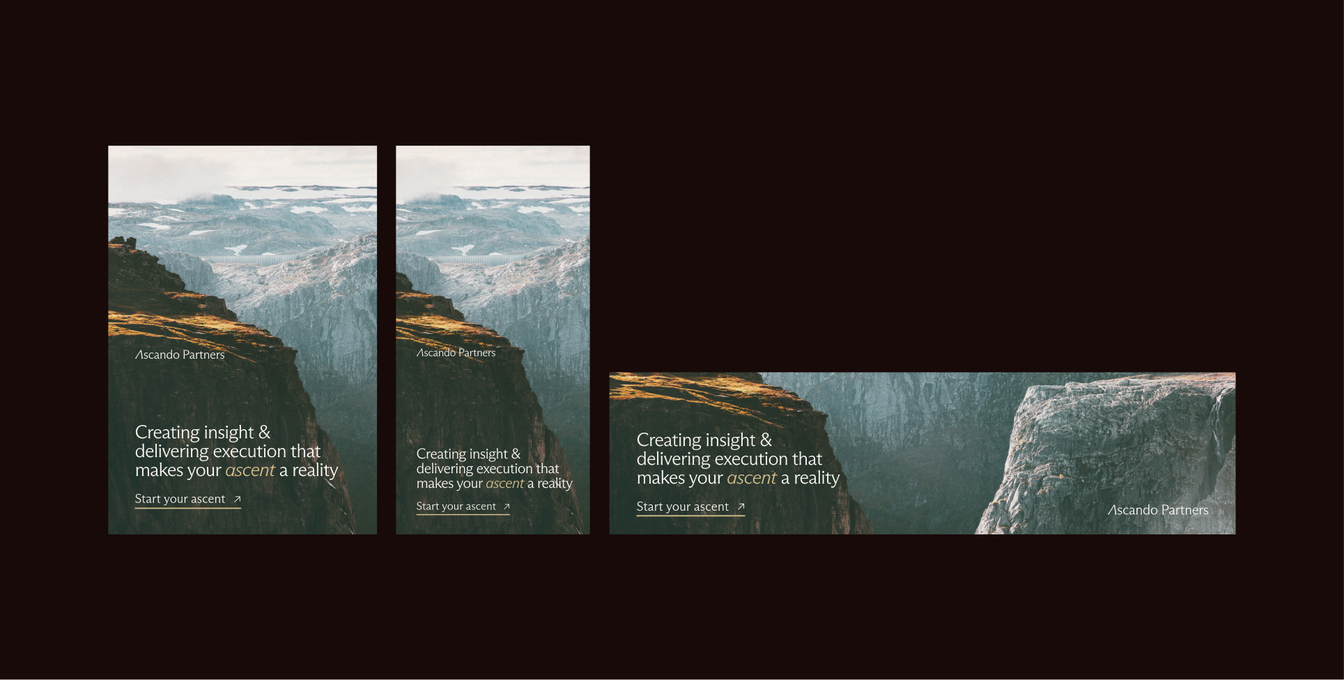
Linkedin employee profile banners
Linkedin company profile banners
Google Ads
Advertising requires precision. Layouts should be built around clarity, contrast, and fast readability. Headlines must stand out immediately, supported by minimal supporting text and a clear call to action. Use color strategically to draw attention, but always within the boundaries of the brand palette. A calm and confident layout performs better over time than visual noise.
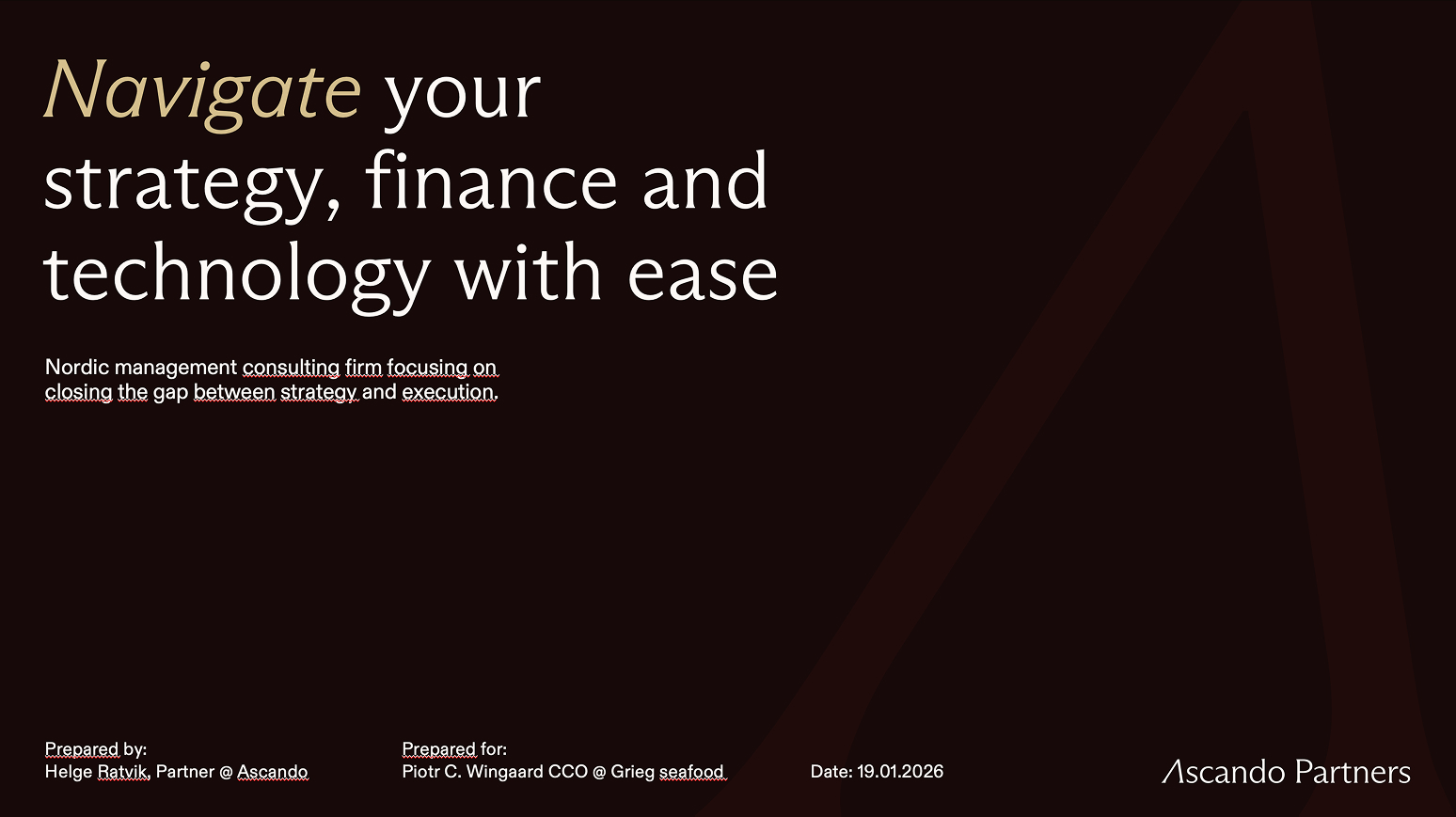
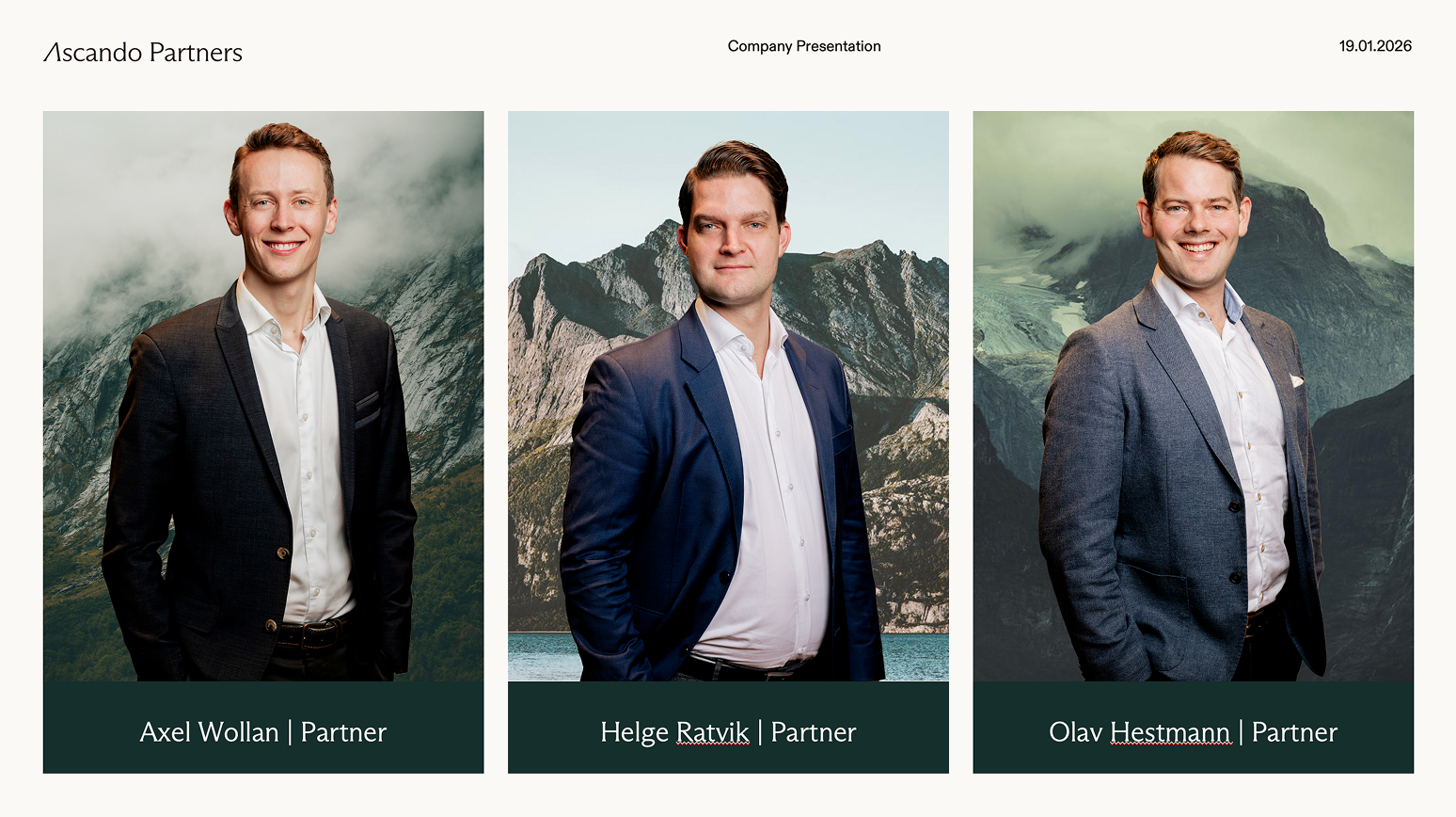
Presentation
Advertising requires precision. Layouts should be built around clarity, contrast, and fast readability. Headlines must stand out immediately, supported by minimal supporting text and a clear call to action. Use color strategically to draw attention, but always within the boundaries of the brand palette. A calm and confident layout performs better over time than visual noise.