Logo
Overview
Our logo is one of the most recognisable elements of the Ascando Partners identity. It represents who we are and how we work. Calm, precise and confident. Consistent use of the logo across all surfaces helps build trust and recognition over time. This section defines how the logo should be used, scaled, placed and protected to ensure a clear and coherent brand expression in every context.
The logo system consists of a primary horizontal version and a secondary vertical version, as well as simplified icon formats for small digital surfaces.Always use the approved files from the logo set. Do not recreate, redraw or modify the logo manually.

Horizontal logo ( Primary )
The horizontal logo is the primary and preferred version. It should be used whenever space allows. This version provides the strongest recognition and should be the default choice for websites, presentations, documents and marketing materials.
Positiv

Negativ
Negativ
Negativ
Negativ
Negativ
Negativ
Positiv
Negativ
Positiv
Vertical logo ( Secondary )
The vertical logo is a secondary option, intended for layouts where horizontal space is limited. Use this version only when the primary logo does not fit naturally within the format or composition.
Positiv

Negativ
Negativ

Negativ

Negativ
Negativ

Negativ
Positiv
Negativ

Positiv
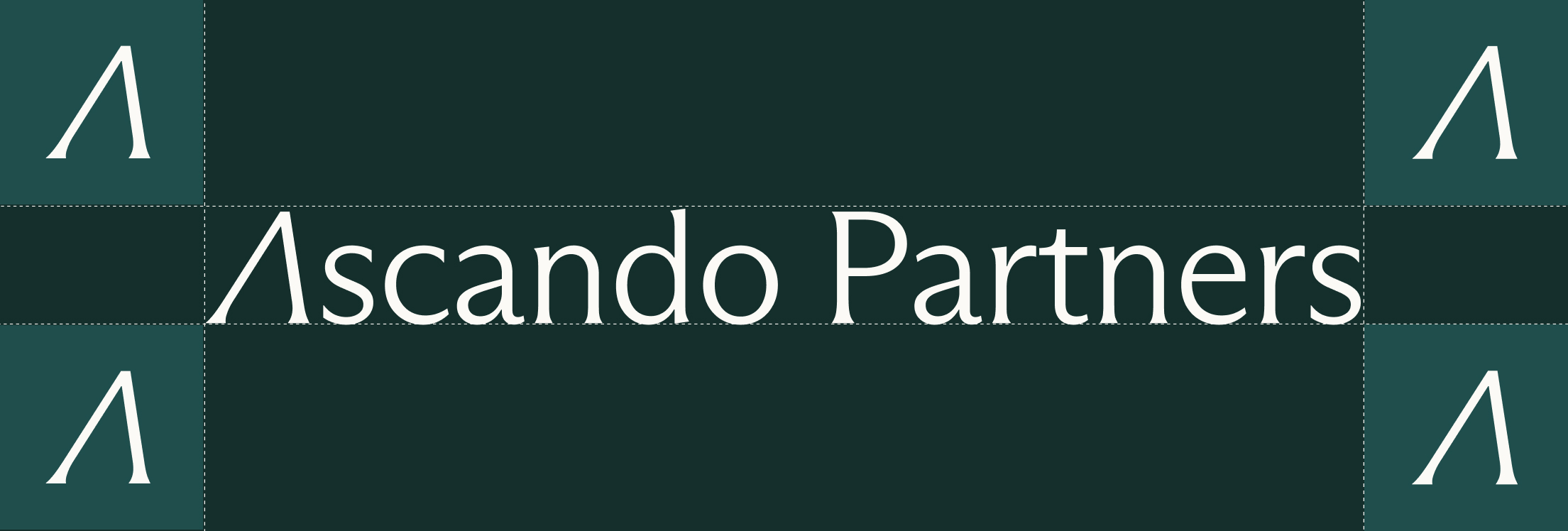
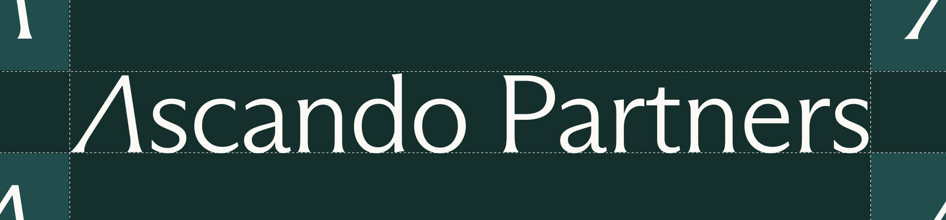
Clearspace
To preserve clarity and visual integrity, the logo must always be surrounded by sufficient empty space. No text, images or graphic elements should enter this area. Clearspace ensures the logo remains calm, legible and visually independent in all applications.
Over 30 piksler logohøyde
Under 30 piksler logohøyde
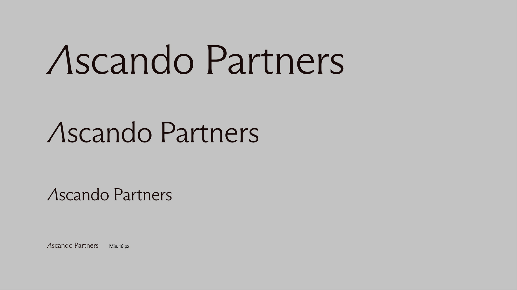
Scalability
The logo is designed to function across a wide range of sizes and formats. It can be used at large scale on facades and signage, and at small scale on digital interfaces and printed materials. Avoid using the logo smaller than 16 px in height, as details may become unclear.
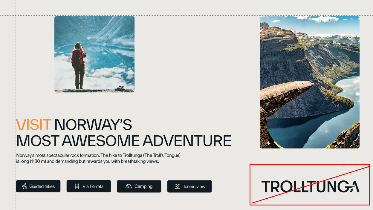
Misuse
To protect the brand expression, the logo must never be altered or decorated. Do not stretch, rotate, outline, recolour, add effects, or place the logo on visually noisy backgrounds. Do not place the logo inside shapes or patterns that reduce clarity or change its proportions. Only approved versions from the logo set may be used.
Outline
Uforholdsmessig endring av størrelse
Vippet
Skjevt
Drop shadow
Vertikal akse
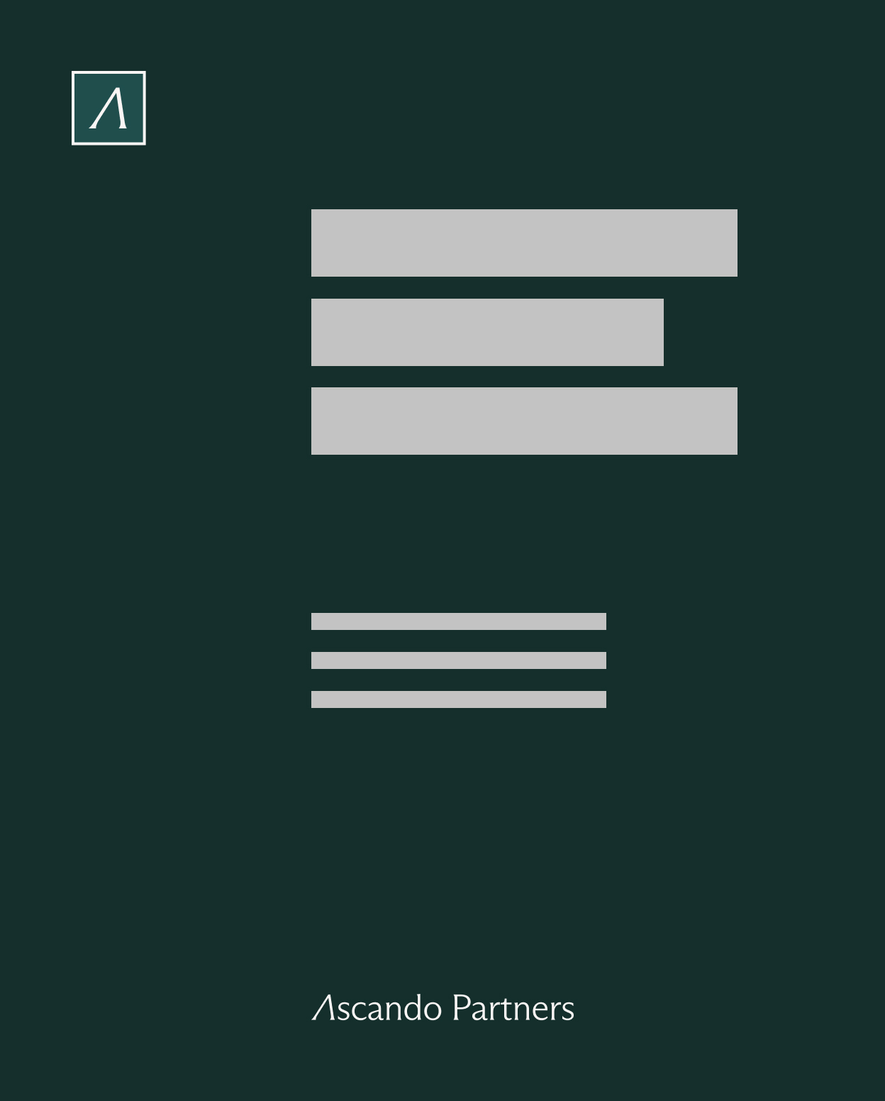
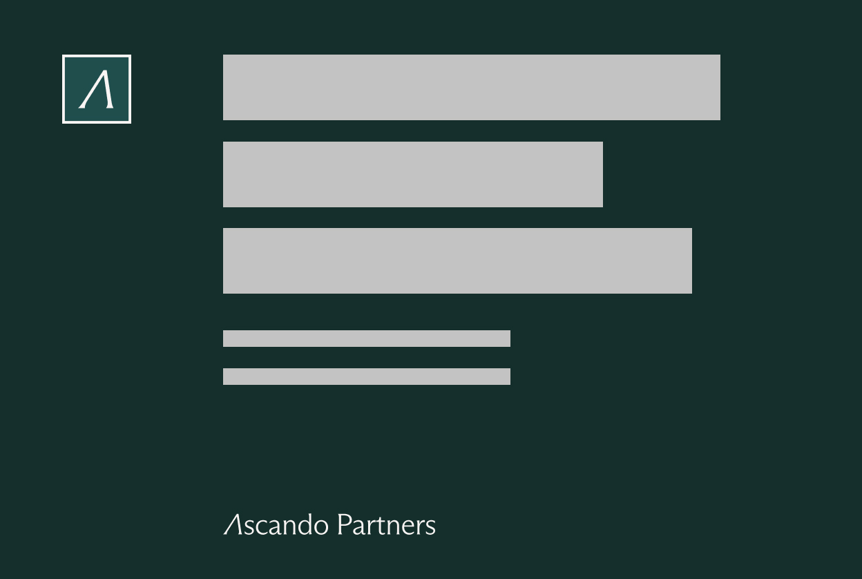
Placement
The logo should always be placed within one of the defined layout zones. Consistent placement creates a recognisable structure and ensures flexibility across different formats while maintaining a unified brand expression.

Der det er mulig, bør logoen plasseres øverst til venstre i layouten.
Ytterligere plasseringsalternativer
Ytterligere plasseringsalternativer
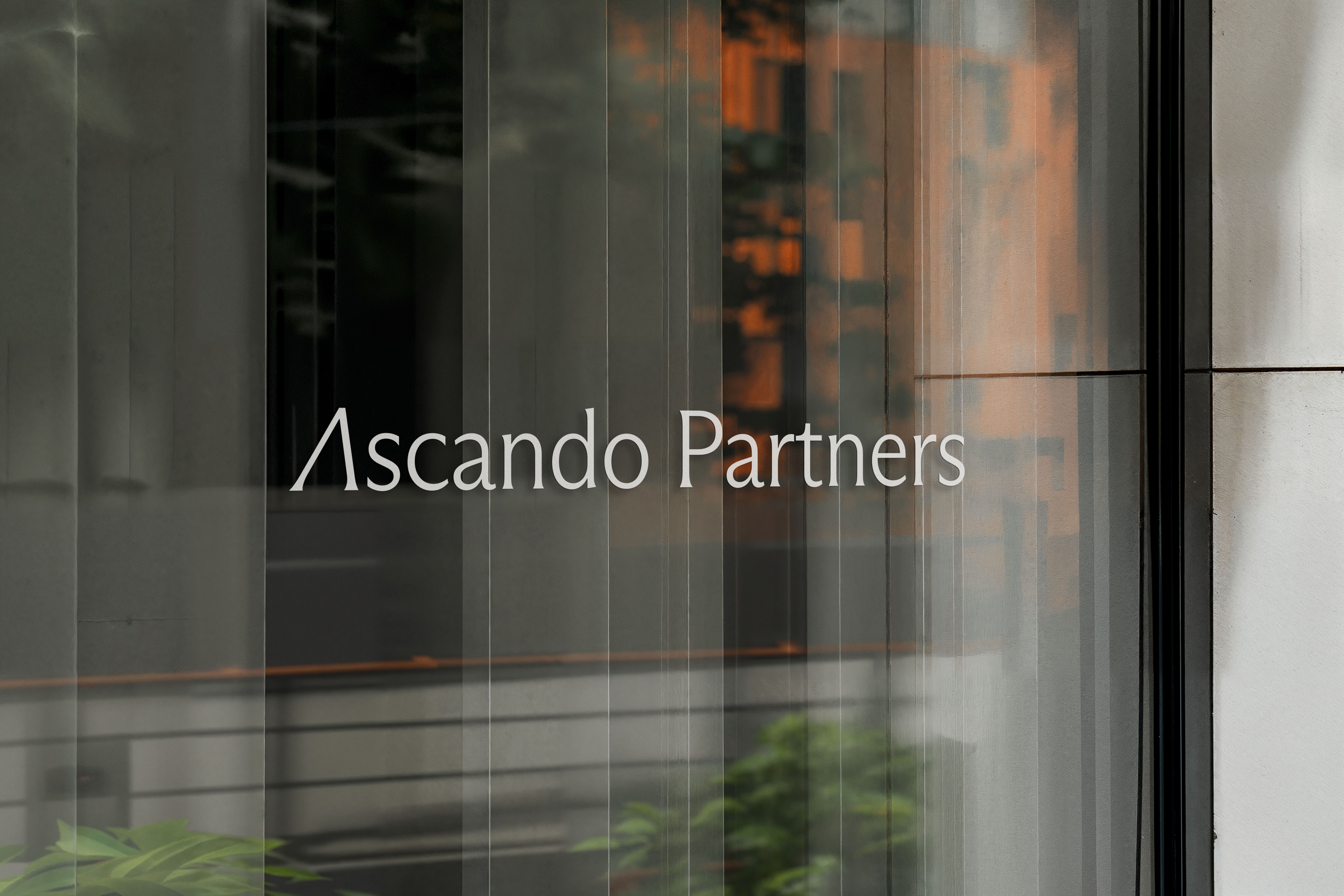
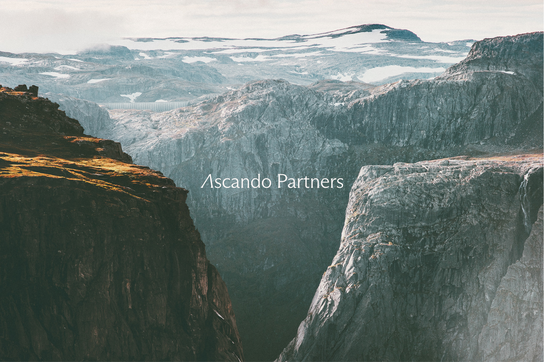
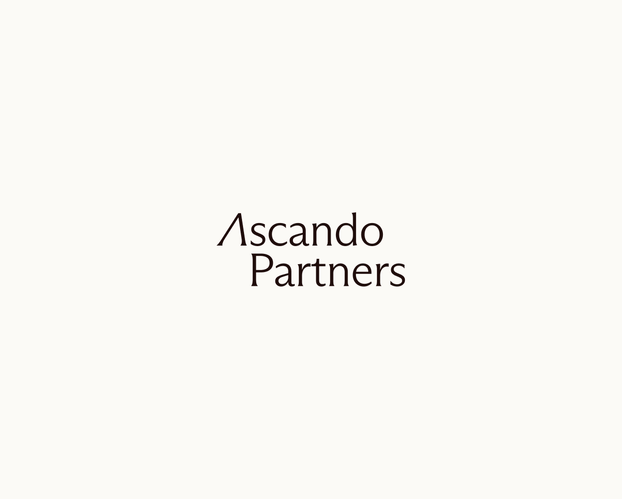
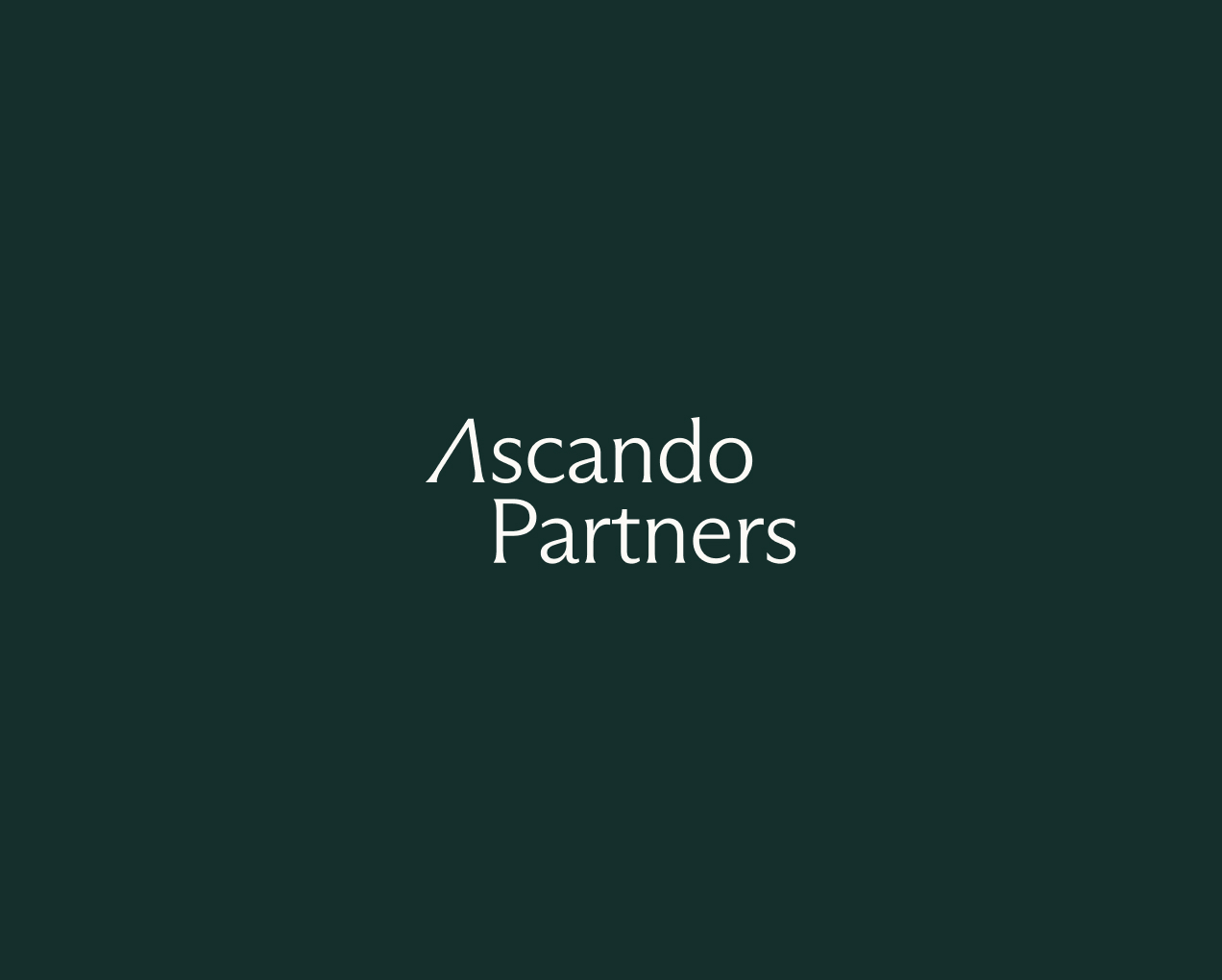
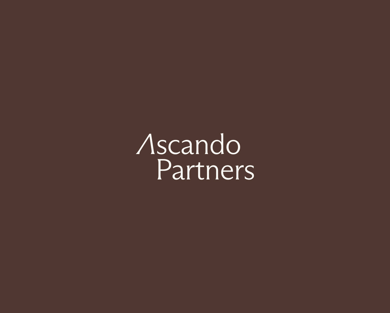
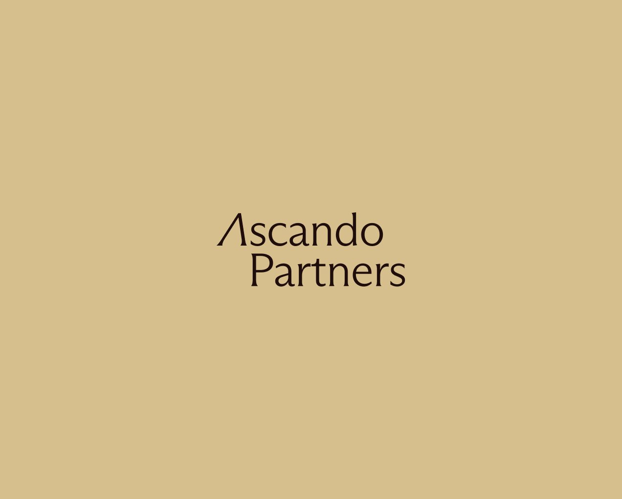
Clarity
When placing the logo on images or coloured backgrounds, sufficient contrast is essential. Use the light logo on dark surfaces and the dark logo on light surfaces. Avoid combinations that reduce readability or visual sharpness. The logo should always be easy to identify at first glance.
Høy kontrast primærfarger
Mørk fargekombinasjon
Høy kontrast primærfarger
Lys fargekombinasjon
Høy kontrast primære og sekundære farger

Sekundær fargekombinasjon
Høy kontrast primære og sekundære farger

Nøytral fargekombinasjon
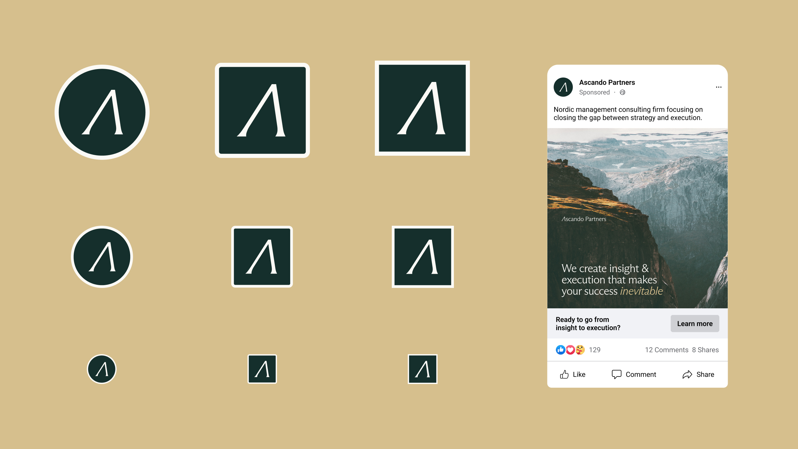
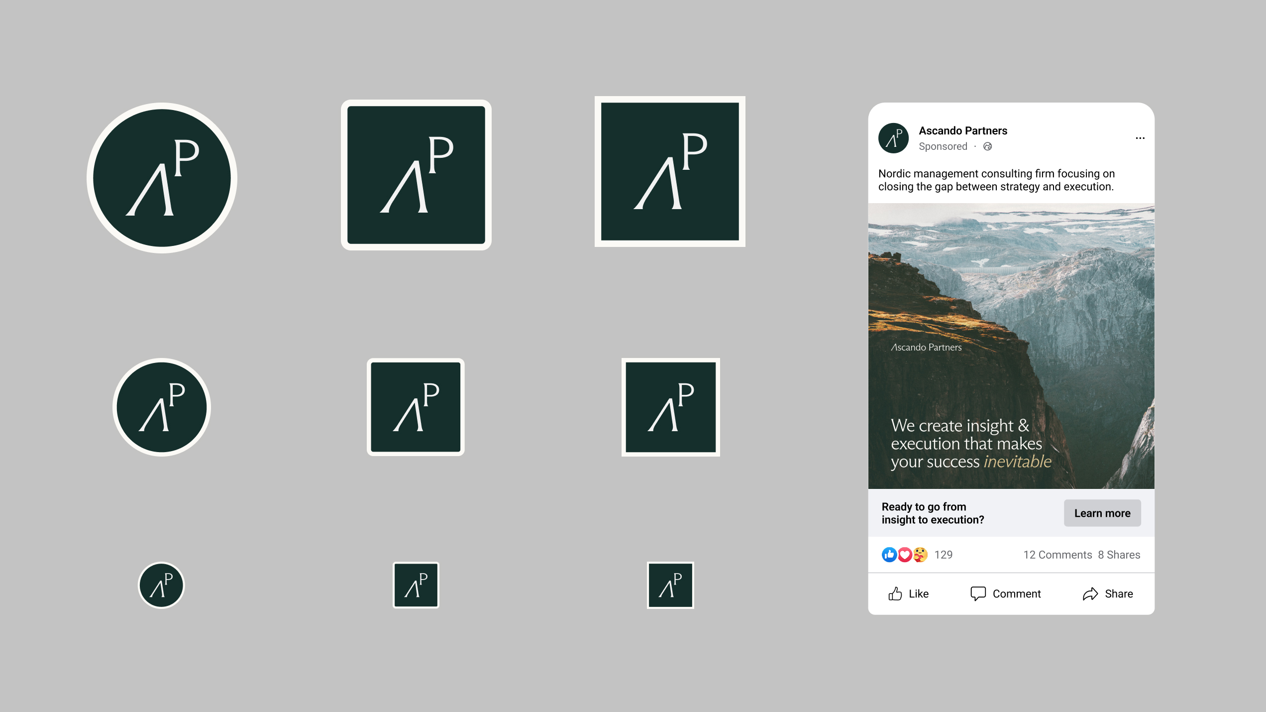
Icons
Icon versions of the logo are provided for use on small digital surfaces such as social media, app icons and profile images. These simplified formats are optimised for clarity and recognition at small sizes. Always use the approved icon versions and avoid cropping or modifying the logo manually.
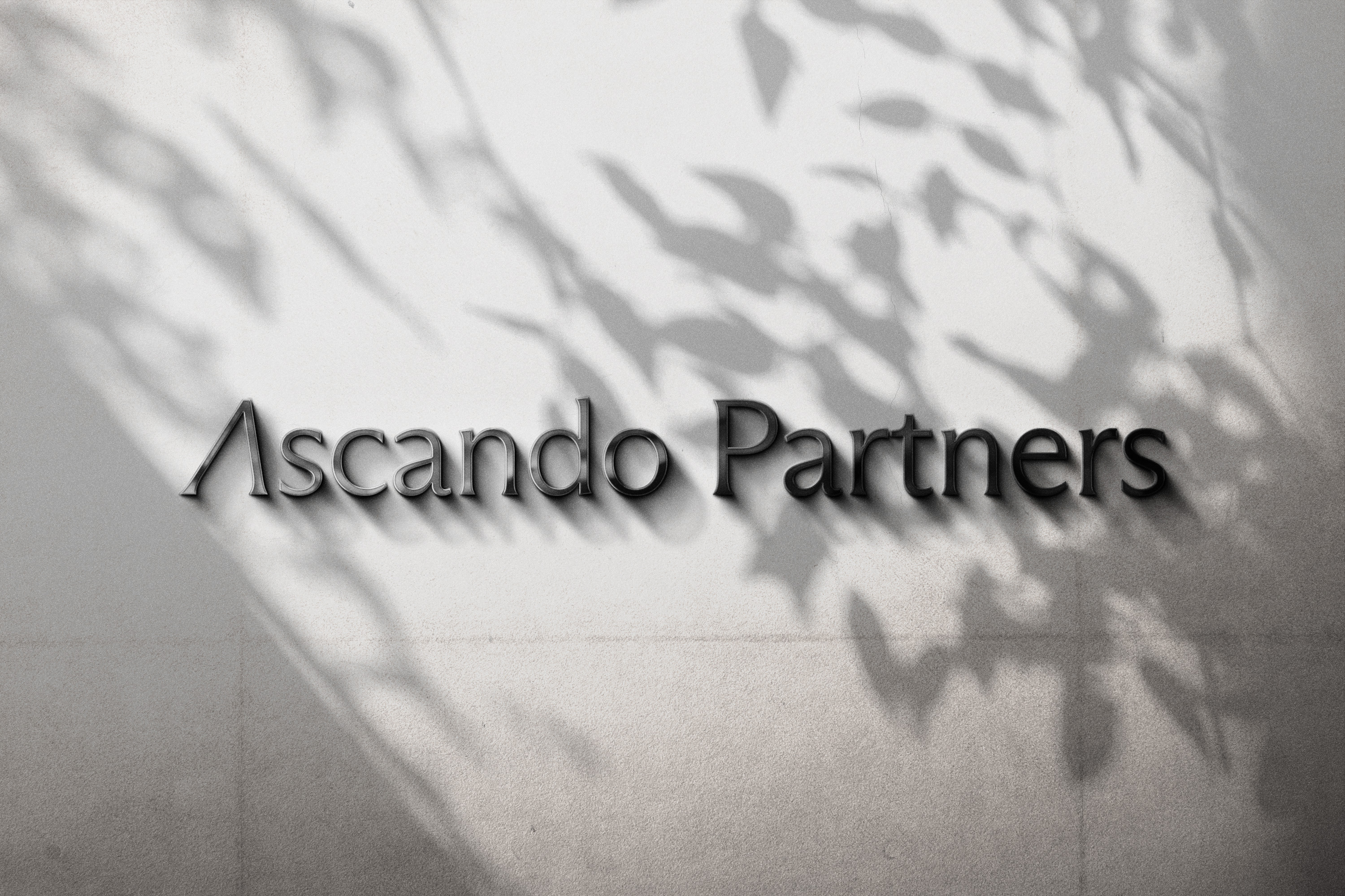
Facade
When the logo is used on buildings or physical installations, background, materials and lighting must be carefully considered. The logo should remain clear, calm and legible from a distance, and should never compete with the surrounding architecture or textures. Choose materials and colours that support contrast and long term durability.