Colors
Color palette
The Ascando Partners color palette is designed to feel calm, confident, and grounded. It draws inspiration from natural materials and Nordic landscapes, combined with neutral tones that support clarity and focus. The result is a system that feels professional and contemporary, without becoming cold or overly corporate. Color is used to support content, not dominate it. White space and restraint are essential parts of the visual identity.
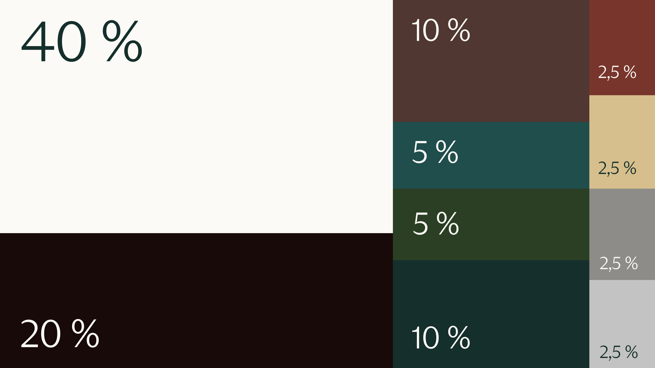
Our palette follows a clear distribution model to maintain balance and visual calm:
- 40% neutral base
- 10% primary dark accent
- 5% + 5% supporting brand tones
- 2.5% accent colors used sparingly
This structure helps ensure consistency across platforms while allowing enough flexibility for creative applications. It is not meant to be followed rigidly in every layout, but as a guiding principle to preserve the overall expression.
Primary colors
Ascando White - Lightest: HEX: #FCFAF6
Ascando dark: HEX: #180A09
Ascando dark green: HEX: #142F2C
Ascando sand: HEX: #d6bf8d
Secondary colors
Ascando brown: HEX: #503831
Ascando light green: HEX: #1F4E4D
Ascando moss green: HEX: #2A3F23
Ascando steel blue: HEX: #174B73
Ascando midnight blue: HEX: #043256
Ascando oransje: HEX: #78352C
Neutral colors
Ascando dark: HEX: #180A09
Ascando mørkgrå : HEX: #8D8C89
Ascando mørkgrå : HEX: #C3C3C2
Ascando White - Lightest: HEX: #FCFAF6
